It was time for a change. We felt the need to breathe new life into our agency’s brand. We would re-assess the who, what and why for 1973 Ltd – and use this to redefine our personality and core values. This analysis and strategy would form the basis for our new visual language – to be expanded into all areas of the business.
The directors sat and carefully discussed our values and brand personality. A lot had changed since the directors had founded the business, and the team had undergone substantial growth in recent years. The result was an entirely different beast to when it had initially been developed. The industry landscape had continually changed and evolved, as competitors had also changed – and in some cases come and gone.

Our new brand had to stand up to our own high standards, stay true to our core values – and have enough personality to provide differentiation from other agencies.
Our values balance our technical proficiency with our positive and trusted reputation. It is a reflection of our people, our approach to work, and is the essence of the brand. Once defined, the brand could start to be designed; finally taking shape in a visual way.
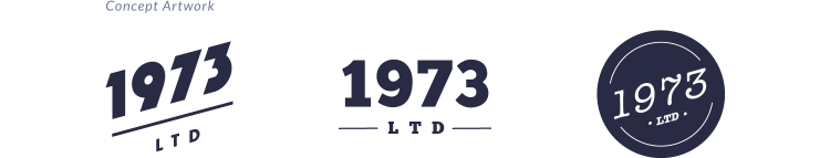
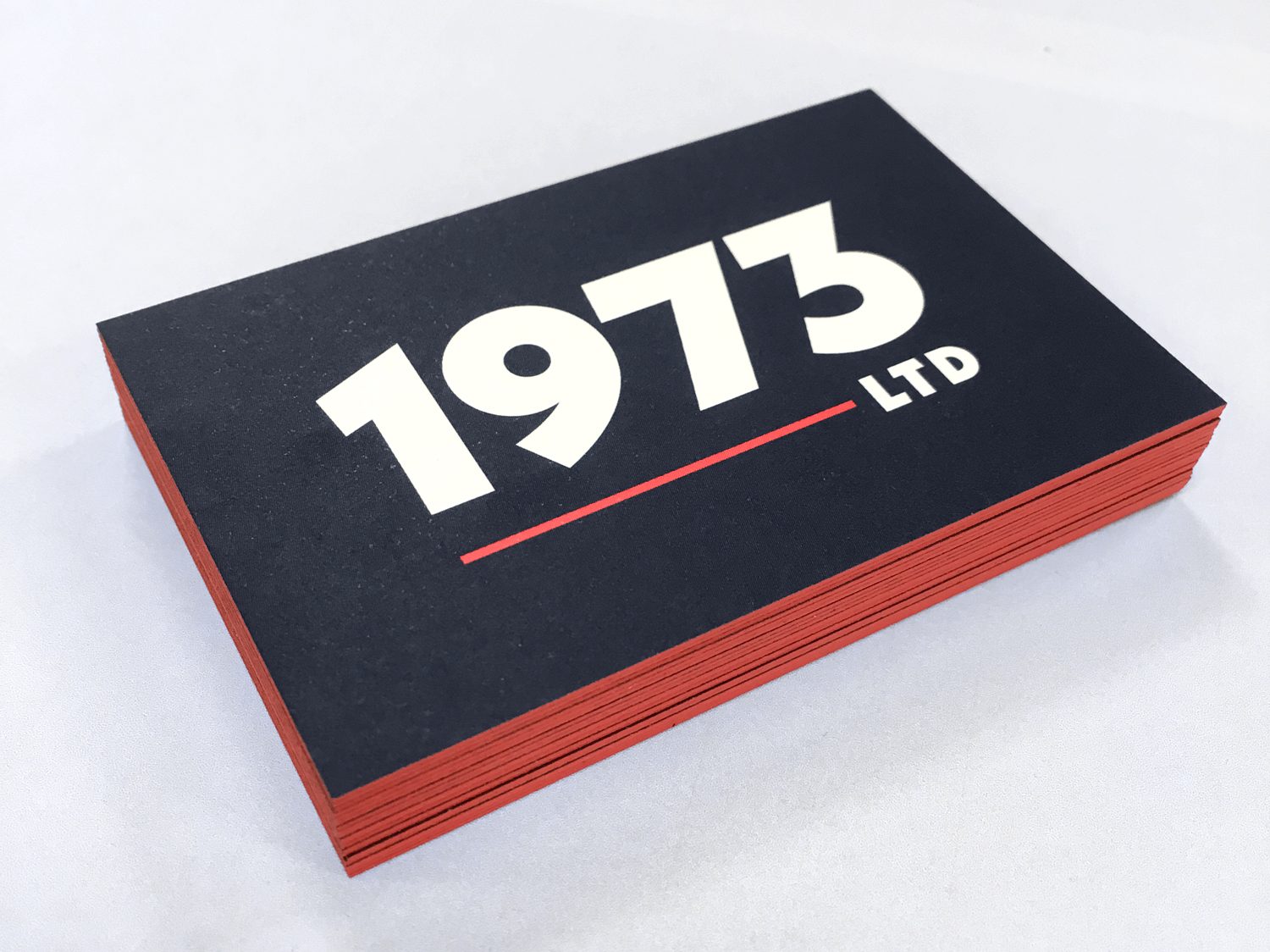
To many, the logo is the fulcrum of a brand’s visual language. Whilst starting with a carefully thought out brand strategy reaps it’s rewards in creating a truly substantial and successful brand, the logo’s importance cannot be underplayed. It is after all a recognisable mark created to differentiate; to communicate; to personify the business itself. We allowed ourselves freedom to explore various routes, some maintaining visual cues to the original logo, others pushing further out of what we identified as a comfort zone. We also created a new brand palette that utilised blue and red from the previous palette, but shifted it in a new ‘grown-up’ direction. It took a while for some to get used to, but we ended up with a wordmark that was significantly removed from the previous ‘badge style’ logo – and we were excited to expand it across our website and associated material.

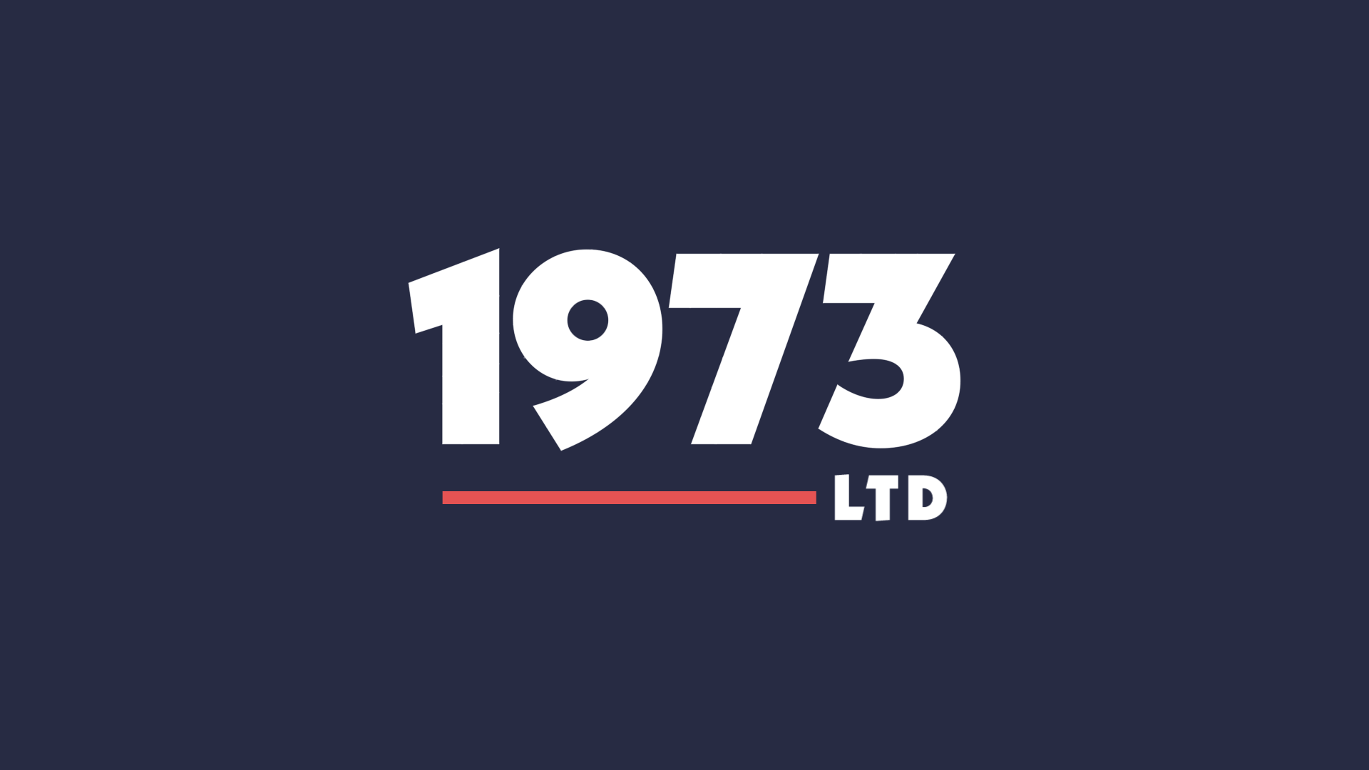
The new logo uses Kabel, a geometric modernist typeface influenced by elements of Art Deco. Neue Kabel Black was widely used in the 1970s (1973 being the DOB of our 2 founder directors) and it’s bold, distinctive letterforms created a balance between personality and heritage. A line grounds the logo and creates an accent of colour, whilst the placement of ‘LTD’ is a nod to the previous logo’s emphasis of ‘3’ – representing the 3 directors. The palette is both classic and contemporary and feels more serious and substantial than our previous palette. The use of coral to provide accents within the navy blue is used prominently to provide subtle focus throughout material. We chose to create a bank of imagery, which is key to communicating the overall brand message throughout our website, documents and social media assets. Themes include technology, lighting and architecture, and images should be striking, real and vibrant.
The journey of rebuilding our brand in-house – piece by piece, was a memorable and rewarding experience. Taking the time to carefully review the business and discover the who, what and why for 1973 Ltd informed the steps we put into action. It leaves us excited to share our brand with the world, and see how it grows alongside our business.
