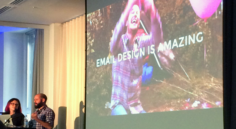
In September Dave and I attended the Litmus Email Design Conference in London, which quite frankly left us raving about all things email! With the slides and talks recently released I took some time to relive it all…
What struck us most about the conference was the sense of camaraderie and support within the email design community. Being in a room full of people who, like us, deal with email design and development everyday was reassuring and, rather than any sort of competitiveness, there seemed to be a feeling of mutual respect over shared experiences. Perhaps email geeks really are united by the cause: #makeemailbetter

But aside from a warm fuzzy feeling, some new Twitter friends and a couple of geeky t-shirts, what did we really get out of the 2 days? Well here you have it, our top takeaways:
Quick Wins…
- Hide the Pre-header text
Some email clients will pull the first bit of readable content in your email and display it as a teaser after the subject line. We picked up this hidden preheader text snippet from Kevin Mandeville at Litmus to define and then hide preview text. - Move the “view online” link to the bottom of the email
A lot of emails now have this in the footer next to the unsubscribe link. Along with the previous point this means the main email content can start at the very top which is particularly helpful on smaller screens. - Make social icons more obvious what they do
All social icons should have a short message beside them telling you what will happen when you click on them – by clicking are you following, sharing, contacting? etc. - Use low-commitment CTAs instead of high-commitments CTAs
Buttons should use wording like “Find out more” or “Shop now”, instead of “Book now” or “Buy now” to encourage clicks from people who aren’t quite sure or ready to take a final action. - Meaningful link text
CTAs should explain what will happen when clicked, rather than where to click. Eg “View the report in your browser” instead of “Click here for the report” - Style alt tags
Add CSS text styles to your images to ensure all alt tags are styled and emails look good and make sense when images are turned off.
New ideas…
- “Please reply” from-address
Rather than the usual “donotreply@” email address, set up a manned mailbox and encourage communication with your subscribers rather than just broadcasting to them. - Web-style navigation menu bars in an email
For some people we spoke to these have been found to increase click-throughs across the entire email in A/B tests vs. having no nav bar. Hamburger menus can be used for mobile versions where this is supported. Could be worth exploring and getting your own stats on. - Add CSS niceties
For email clients that support them, subtle usability improvements like hover states can be added without doing any harm to the experience in clients that don’t, assuming file size is kept in check. - Use animation to delight where appropriate
CSS animations and animated gifs are fun and eye-catching to incorporate where they have relevance. Be careful not to over-do it however as this may dilute their effectiveness and distract from the main message/CTA. - Targeting
Use media queries and hacks to target specific email clients / times / weather with different content Eg. More appropriate content depending on whether you’re on a desktop or mobile, different content at night to day, triggered emails if it snows etc. - Fluid emails
A method of building responsive emails without media queries for better Gmail support, demonstrated by Fabio Carneiro’s code examples.
Tools and resources
Litmus Community – Snippets, useful things, discussions etc.
Github – How to use Github
Phrasee – Subject line Resources
Emmet – Shorthand coding toolkit
Sublime Text – Text editor for code
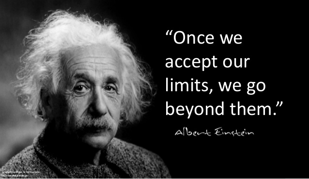
So there you have it, plenty of juicy stuff to get our teeth into. But above all our main takeaway was a feeling of empowerment that anyone can push the boundaries of email marketing and discover the next big thing, so we shouldn’t be afraid to experiment and try new things. Email development can be just as exciting as the web! As Albert Einstein said:
